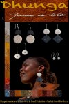
A few days ago I posted about the ‘branding’ of Yvonne’s (my wife) jewelry or jewellery (for the Americanos). I’m not a graphical designer but one of our neighbors is. I was stuck with the header; in fact it was a point of sophisticated discussion (no plates broken, etc.) between me and my client. So our neighbor came in and she was first of all amazed of the collection. For people from outside South Africa like us, it’s sometimes difficult to understand that South Africans in general are not great believers in the products developed and made in their own country… With her advise we changed a few minor things. First of all a better readable (Geneva instead of Chalkduster) lettertype for the footer. But the major issue, the header, needed a bit more upgrading. We enlarged the two text lines (full width) and added some soil in the background. Next we brightened up the name Dhunga. Yes; we are all Happy now. The entire concept of the layout etc. was done in Photoshop CS6


I like the earthy look a lot! Natural elegance.
Blessings ~ Wendy
LikeLike
Fashion guru from NYC: … “Cool concept….”… 🙂
LikeLike